
As promised, below you’ll find a selection of projects I’ve worked on over the past few years. Most were done for National Geographic magazine where I worked as the Art Research Editor for almost seven years before starting my own business (and with whom I am currently working on several freelance projects). Some were also mentioned in the presentation I gave last year at Malofiej 21: “Reaching the Impossible, by Researching the Possible.” It goes without saying, but each of these graphics was a team effort. None would have been possible without the incredible resourcefulness, creativity, and collaborative nature of my talented colleagues. For more information on the work of the Art/Maps Department at National Geographic, please visit Juan Velasco’s blog.
__________
When you work in journalism, it helps to have an insatiable curiosity for just about any topic. From space exploration, to the American Civil War, to nuclear reactors, to epigenetics, to Ancient Rome, to the global capital markets . . . you name it, and I’ve probably researched it. And thus, below you’ll find various different kinds of graphics – scientific illustrations, timelines, data visualizations, and historic recreations – each designed according to the particular needs of the subject matter. Instead of just showing you the end product, however, I’d like to walk you through some of the “behind the scenes” aspects of how these particular graphics came together. That is, after all, where I come in . . .
Research is the key to creating any successful journalistic endeavor, and information graphics are no exception – you have to know something about the topic you’re working with before you can start building a graphic. Often, the best way to do this includes talking to experts in the field, searching for data, reading up on the latest scientific papers, and seeing what other media outlets have published on the topic (if applicable). When I worked on a story about the “Blue Holes of the Bahamas,” I interviewed ten different scientists to help explain one particular underwater cave’s environment, history, and significance. Below is the final version of the graphic published in the August 2010 issue of National Geographic:
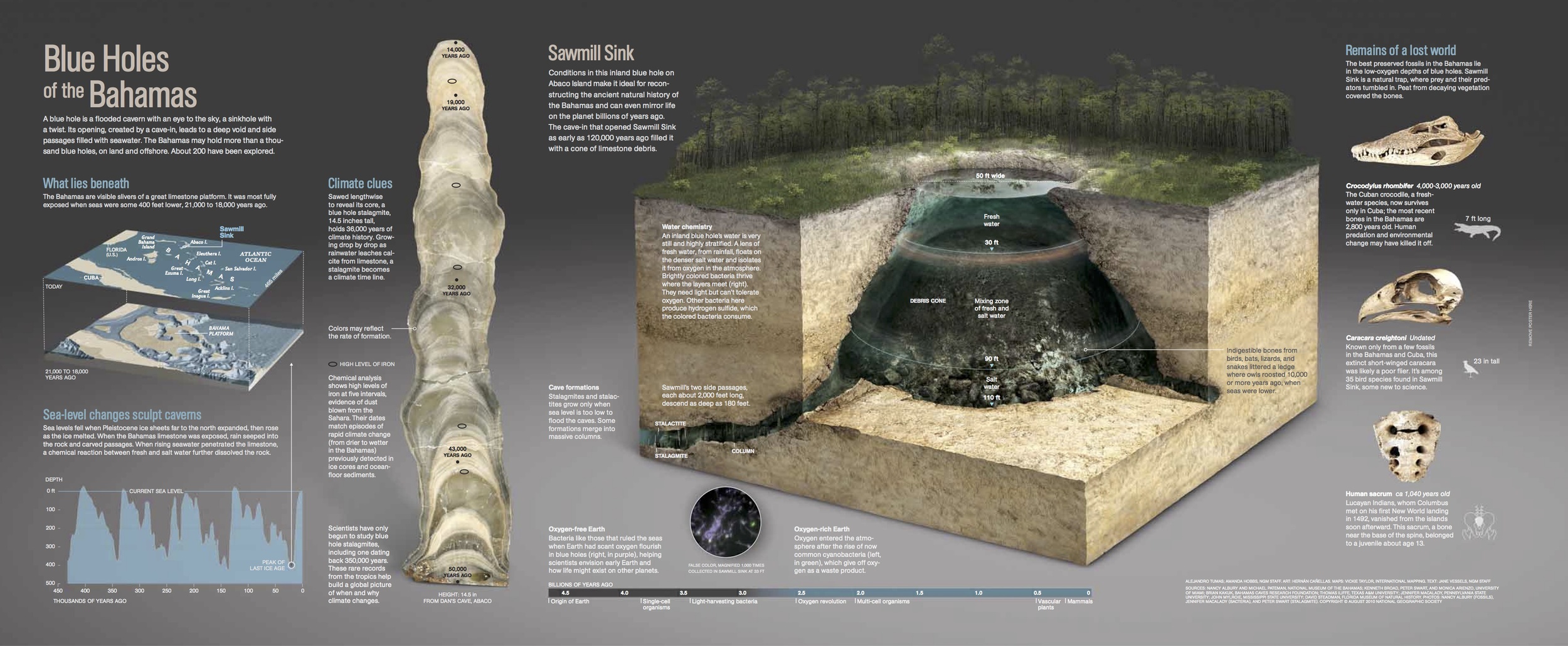
National Geographic magazine, August 2010. Reproduced with permission. Alejandro Tumas; Amanda Hobbs, NGM staff. Art: Hernan Canellas. Maps: Vickie Taylor, International Mapping. Text: Jane Vessels, NGM Staff.
In order to produce a graphic like this, I first put together a research packet for the Graphic Editor (Alejandro Tumas) containing interview notes, diagrams, maps, charts, photos, and suggestions for things to focus on:

The scientific findings I suggested we represent in the graphic were not just fascinating, but incredibly complex, and often interlocking. The research packet allowed us to see the depth and breadth of the subject matter, but also to better estimate how much room we might need to tell the cave’s story. I’m fond of saying that the information you collect is only as good as your method of organizing it, and for this story that definitely proved to be the case. We had so much information, and so many parts of the story to tell, that we had to be as organized as possible to make sense of it all. Only after months of consultation with experts, copious edits, and several rounds of text revisions were we able to create the final version.
In the case of “Blue Holes of the Bahamas,” it was decided very early on that the main part of the graphic would be a reconstruction of the cave. So, even though it took tremendous effort to explain how the cave formed and why it was so interesting to scientists, we at least had some sort of an idea of what our main focus would be. For many stories, however, there isn’t such a clear-cut path to follow. For example, take the King James Bible story that appeared in the December 2011 issue of National Geographic. We knew we wanted to do some sort of graphic that addressed the history of biblical translations leading up to the KJB, but we weren’t sure exactly what this meant, what it should look like, or if it would be interesting to readers. As I began researching, I also began drawing, making connections, and searching for patterns. The diagram below is what emerged: the most important biblical translations (edited for space and clarity) arranged in chronological order and connected by lines of influence, color-coded by the language of translation.

Sketch: Amanda Hobbs
While it may seem logical to assume one translation would begat the next, the real story was that more often than not, the influence of an earlier translation on a later one didn’t proceed in a straight line, but jumped around, and often in surprising ways.
Having something visual to show the designer enabled us to talk in more concrete terms about what something like this could (and should) look like, and it helped us to outline our thoughts and begin the process of organizing the entire magazine spread. Below is the end product. Though different from the original sketch, you can see the continuity. Having a firm plan from the beginning – based in solid research – helped us to save time in creating the final version. We knew it would work, we just had to get the presentation right.
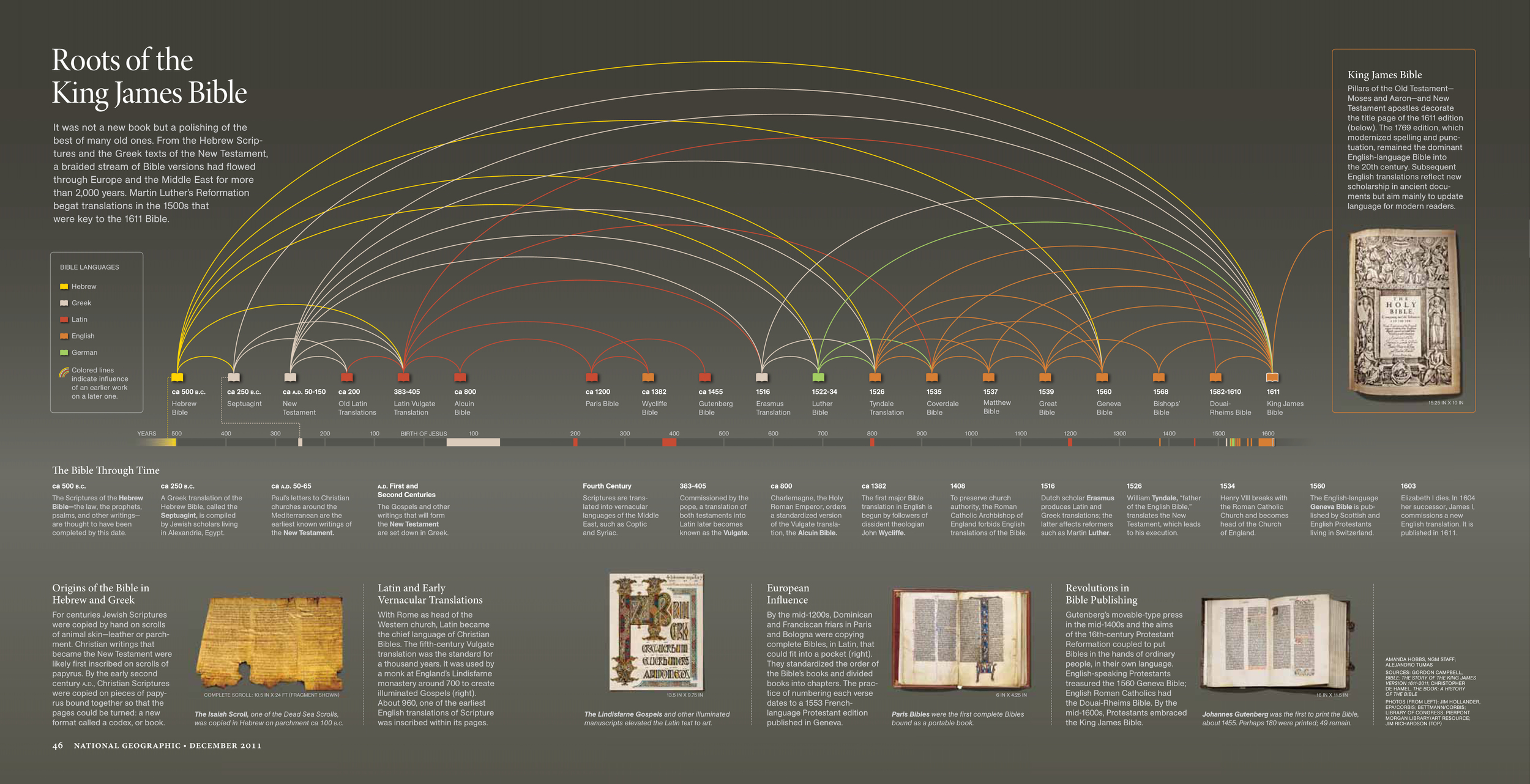
National Geographic magazine, December 2011. Reproduced with permission. Amanda Hobbs, NGM staff; Alejandro Tumas.
While we’re speaking of timelines (and history not flowing in a simple, linear fashion), here’s another example from a freelance project I worked on in 2013. It’s a timeline of the history of exploration, which not only shows the adventurous side of human nature, but also how discoveries in one area of exploration can and often do affect others.

National Geographic magazine, June 2013. Reproduced with permission. Matthew Twombly and Jane Vessels, NGM Staff; Amanda Hobbs.
I like this exploration timeline because it illustrates an important point regarding the research and editing of a graphic. World history is a HUGE topic, even after you look at it just in terms of exploration. Indeed, what does “exploration” mean? To research something means you must first define it, and it turns out that lots of different people define exploration in lots of different ways. Fortunately for me, I was working with two amazing colleagues on this project, Jane Vessels (Text Editor) and Matthew Twombly (Graphics Specialist). In the end, we decided to focus on not only physical exploration (going to a place you’ve never been before), but also the different reasons for exploration (trade, conquest, spiritual quest) and the tools that helped make it possible (maps, navigational equipment, advancements in transportation). Coming to this decision, however, took several months of research and dozens of rounds of edits. Below are three such rounds – apologies in advance for my copious use of colored ink and highlighters (I do so love a good marker).


Not all graphics can be timelines (thank goodness!), but many do involve the element of time, and more specifically, change over time. The graphic spread below was part of a story dealing with current levels of sugar consumption in the United States and how it has changed from the beginning of the 20th century to today.

National Geographic magazine, August 2013. Reproduced with permission. Photo illustration: Robert Clark; Lawson Parker, NGM staff; Amanda Hobbs; Alejandro Tumas
Sounds pretty straight forward, right? Well, it turns out this can be harder to measure than you might think. First, are you talking about naturally occurring sugar in foods like fruit, the kind you keep in a sugar bowl, or the high fructose corn syrup found in most processed foods? Oh, and what about the sugar that we don’t really think of as sugar, but after you eat it your body converts it into sugar? Researching this story was truly an education in itself (with the immediate outcome being that I now eat less sugar, and you should too - the statistics are terrifying).
Putting together a graphic like this meant sifting through mounds and mounds of data and statistics. Because of course, when you’re starting from scratch, the data is the best place to find inspiration.

And, once I had a look, I started compiling it in different ways to flush out the most compelling stories. For this graphic, we especially wanted to show how easy it was for people in the United States to consume the daily average of 22.7 teaspoons of “added sugar” (i.e. not the kind you find in fruit, but the stuff in your sugar bowl and in the processed foods that you eat).

What we ended up with was both startling and surprisingly simple to illustrate (although getting the look just right required incredible diligence on the part of the Graphic Editor, Lawson Parker, and the Photo Editor, Susan Welchman). Turns out, it doesn’t take much to equal those 22.7 teaspoons of sugar. For example, the following combination is what we highlighted in our graphic:
- 1 cup of Lucky Charms cereal
- 4 slices of bologna
- 2 slices of wheat bread
- 3 tablespoons of ketchup
- 3 Oreo cookies
- 1 8 ounce container of fruit yogurt
- 1 12 ounce can of cola
Crazy. Though, I must say that in many ways I’m surprised that the average isn’t higher . . .
At the opposite end of the graphics spectrum is one of my favorite things to work on – historical illustration. As a historian, I find it particularly fulfilling to work on projects where I get to be a part of bringing a specific time and place back to life. Whether they are scenes of historical significance or archaeological reconstructions (or both!), these pieces are a true combination of sound research and artistic beauty.
Take the example below. Created for a story on the Incas, it depicts a ceremony where the mummified remains of previous rulers were brought into the main plaza of Cusco:
National Geographic magazine, April 2011. Reproduced with permission. Art: Jon Foster, Jeff Osborn; Amanda Hobbs, NGM Staff.
Some might look at this piece and think that it’s just an "artist’s interpretation." Though the artist played a huge role in the creation of the artwork, the whole story was something much larger. Before we could even get started on the mummy scene, I traveled to Peru to visit the historical sites of Cusco and Machu Picchu and speak with archaeologists studying Inca artifacts, architecture, and culture. From the clothing and headdresses to the exact texture of the mummified skin, all aspects of the scene were copiously researched and discussed at length with archaeologists, art historians, and textile experts. The image below shows four examples of the visual references on which the artist based his illustration:

Yet, creating a scene isn’t just about representing material objects, but about human interaction. Beyond collecting images of artifacts and clothing, you have to determine where the scene should be located, who should be in it, what sort of action should be shown, when it occurred (year, time of day, season), why it’s important, and how it might have happened. This meant doing additional research into all aspects of Inca religion and social structure to understand what roles the individuals in the scene would have played and how they would have interacted with each other. After all, you can’t just call the artist and say “Can you draw some sort of ceremony with mummies in it?”
When the historical record didn’t provide enough clues as to exactly what something might have looked like, or how something in the ceremony would have transpired, we asked experts to give us their best guess. This is often a fun, but arduous process, and one that can result in multiple revisions. The artist for the Incas piece, Jon Foster, was a model of patience with us. Below is a succession of images highlighting the numerous changes we asked him to make in order to get one particular part of the illustration “just right.”

Art: Jon Foster
Of course, sometimes the pursuit of accuracy has less to do with research or getting the experts to make their best guess, and more to do with overcoming unforeseen obstacles. I usually pride myself on thinking two steps ahead (credit here goes to my father for teaching me to play chess at the age of four), but even I could not have predicted the government shutdown in the fall of 2013. At the time, I was working on researching a graphic for Scientific American on the appearance and spread of Cryptococcus gattii, a nasty fungal infection that started showing up in the Pacific Northwest in the late 1990s. I was able to contact the CDC only once before it, and many other government agencies, were closed due to the shutdown. Solution? Contact each individual state health department and create my own shorthand database so we could continue refining the graphics (and pray the CDC would open again before the article went to press). To stay up to standard, and on deadline, you have to be willing to go the extra mile.
And there you have it – a little insight into what I do and how I do it. I guess you could say that I’m an editorial “jack-of-all-trades,” but I think when you get right down to it . . . I’m just a problem solver at heart.